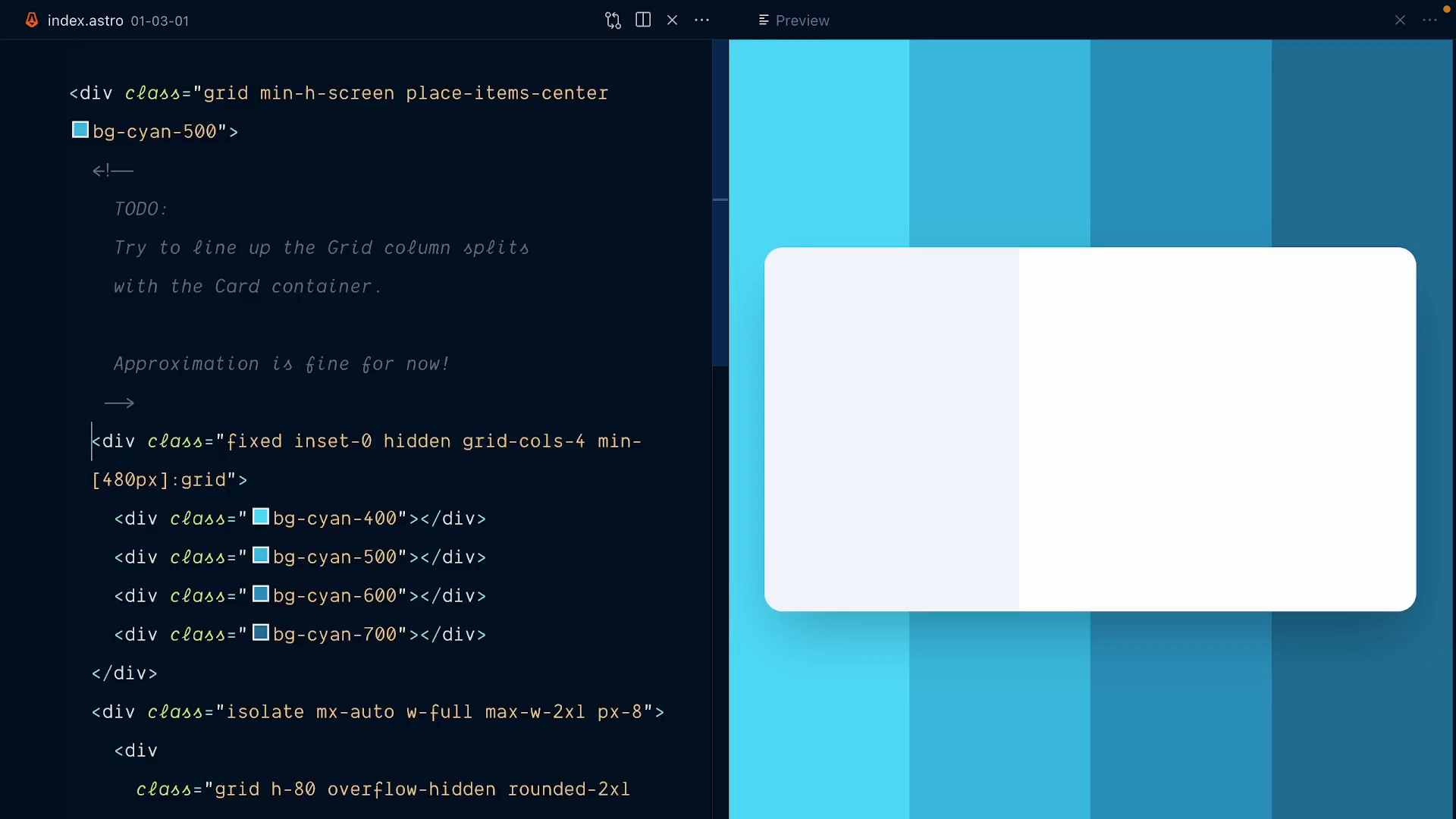
Lining Up Grid Columns with the Card
We have a four column full screen grid, defined with grid-cols-4.
It's a good start, but the columns are not aligned with the card yet:
In
Transcript
0:00 We have a four-column full screen grid. That's a good start.
0:03 Right now, we're using grid-cols-4 to define our four columns. Obviously, the columns are not aligned with the card yet, and this is what we'll start working on in this lesson. Even if it's going to get a bit hairy and almost offensive to some, we'll do all our work directly in our HTML.
0:18 We're going to write an increasingly complex, arbitrary value class for our grid columns. We can replace the 4 here with square brackets, which allows us to declare any custom grid template columns value. You can already see this in action in our markup if I go down a bit.
0:33 Here, at the 480px mid-width breakpoint, we define grid template columns with grid-cols-, and then an arbitrary value. This represents the two panels of the card here. You can see we even use a value from the theme. Here we grab width.56. This is what defines this side panel width.
0:50 This class here gives us really good insights on some of Tailwind's superpowers that we can use to prototype our background color splits. We can use arbitrary values, we can pull the theme values directly in the HTML, and we can use fraction units for fluid width.
1:05 Your challenge is to replace this grid-cols-4 class with a custom, arbitrary four-column grid definition. You don't have to be too precise just yet. Approximation is fine for now. Don't worry about responsive adjustments, think in desktop only. All the hints are here in the HTML classes to give you information on what dimensions our grid columns should have.
1:25 Good luck.