

Recently, shadcn launched Themes, a new feature for the highly popular shadcn/ui library.
The new themes let you pick a primary color, a border radius and a typography to make your app more unique:
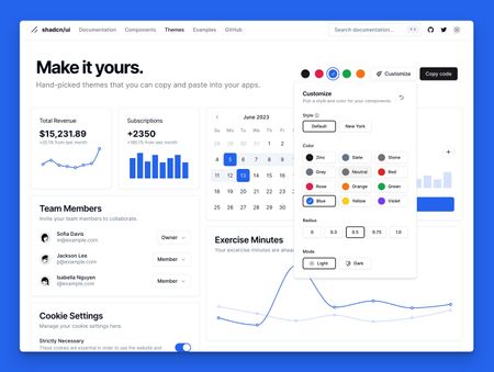
It's all implemented with CSS variables and "theme scopes", precisely like what we're learning in the "Multi-Theme Strategy" Pro Tailwind workshop.
If you've taken the workshop and wanted to see a real-world example of what you could build with your new superpowers, shadcn/ui's themes are a great one!
Matter of fact, about a month ago I recorded a YouTube video where I wrap shadcn/ui's theming strategy inside a Tailwind plugin, for re-use across multiple projects: