

Improving the DX with TypeScript
Right now, the developer using our component doesn’t really have any information or hints on what variants and sizes options are available for this Button.
We’d need to write some documentation, or they’d need to read the source code of our component to figure that out.
Sure, we could add prop-types to our component, but wouldn’t it be nice to have to autocomplete suggestions in the code editor about what props and prop values are available?
And get a warning before saving if an incorrect prop or value is passed to the component?
I feel like this would be a great developer experience upgrade.
We can do this with relatively minimal effort here, using TypeScript.
This is not a course about TypeScript and how to set it up. Let’s assume we’ve got the environment to work with TS, and our Button component file has a .tsx extension.
I’ll show you how a couple of lines of code can really improve the developer experience when using our component.
Using our lookup objects for documentation and Type checking
We could use Enums here to define our prop values. They’re pretty powerful.
But think about it: our lookup objects, in fact, communicate the available options for the variant and size props very well already!
We can take a lighter approach here and use these lookup objects to generate Types directly, using TypeScript’s keyof typeof goodness.
This will generate a Type that represents each key of our lookup objects.
Check this out:
type ButtonVariant = keyof typeof variantsLookuptype ButtonSize = keyof typeof sizesLookup
Whoaaa 🙌
Now let’s combine those two Types together in an interface to use for our button props:
interface ButtonProps { variant: ButtonVariant size: ButtonSize}
The <button> element has its own Type, too!
Technically, our Button has more props than just variant and size.
Think of all other attributes a button can have, like disabled, type, etc.
Let’s update our interface to extend HTML buttons’ native props.
We’ll import type { ComponentProps } from 'react' at the top of your file.
Then, we can do this:
interface ButtonProps extends ComponentProps<'button'> { variant: ButtonVariant size: ButtonSize}
Now, we can use this ButtonProps interface on our Button component’s props:
export const Button = (props: ButtonProps) => { const { variant, size, ...rest } = props return <button {...rest} className={...} />}
And we’re good to go!
What did we gain by doing this?
Let’s try to consume our Button component one more time to find out!
Again, make sure the file where you consume the component has the .tsx extension.
Without having to import anything type-related, here’s what happens when I try to add a variant prop to my button:
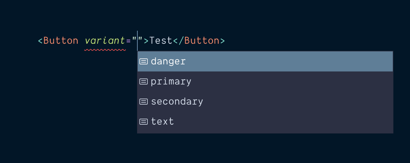
Boom! A list of accepted values the variant prop can receive shows as autocomplete suggestions.
If I pass an invalid value (say I make a typo), TypeScript will let me know something’s wrong:

Whoops, thanks for that, TypeScript! Let’s fix the typo.
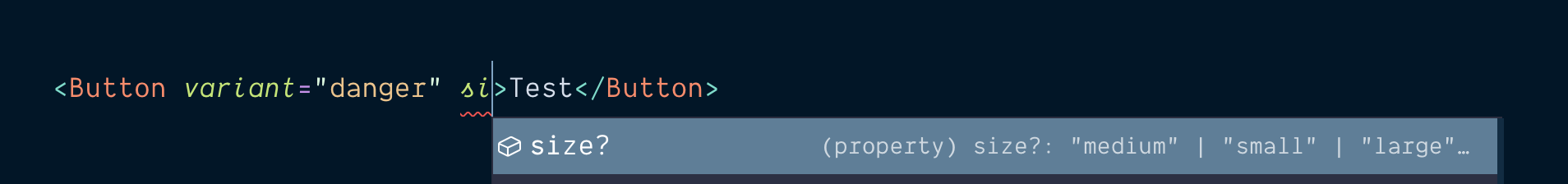
Now let’s try adding a size prop.
As soon as I start typing the prop name, here comes a suggestion:
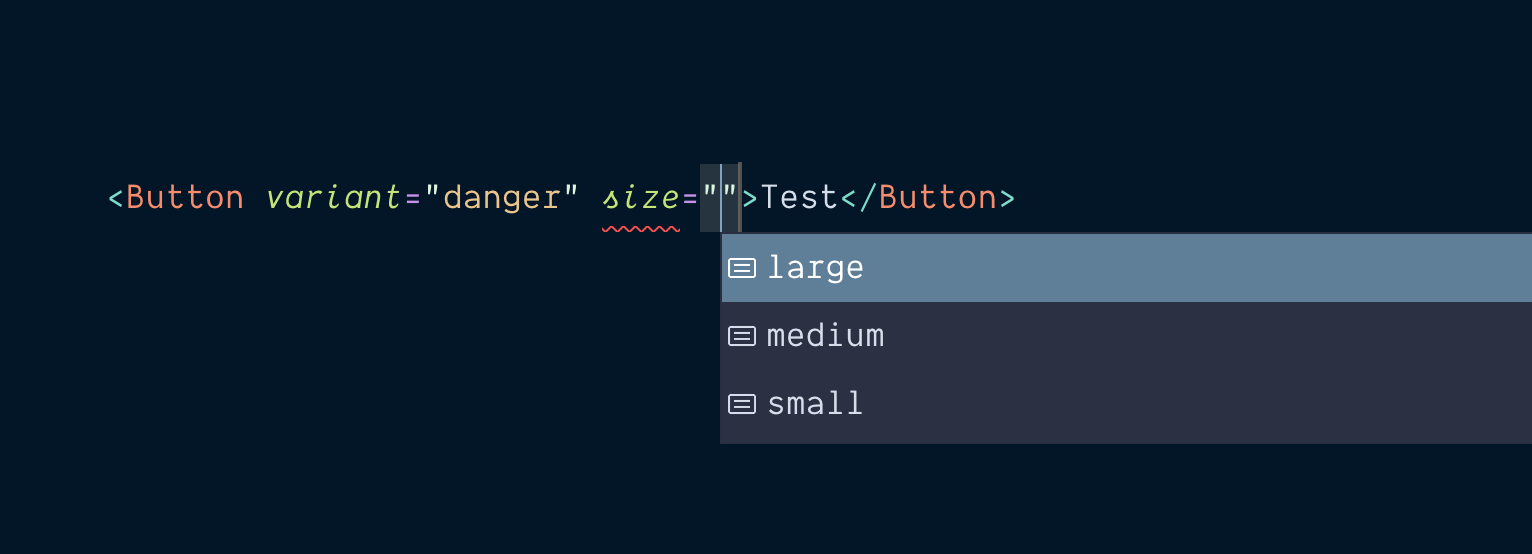
Once again, the available values are listed for me to pick from:
This is super rad!
I’m new to TypeScript myself, but this stuff gets me really excited 🎉
I think that was well worth the small effort. We only added a few lines of TypeScript in our source code, and the developer experience is significantly nicer now.
Here’s the full code for our Button component now, Types included:
import type { ComponentProps } from 'react'const baseClasses = 'rounded-md font-medium focus:outline-none'const variantsLookup = { primary: 'bg-cyan-500 text-white shadow-lg hover:bg-cyan-400 focus:bg-cyan-400 focus:ring-cyan-500', secondary: 'bg-slate-200 text-slate-800 shadow hover:bg-slate-300 focus:bg-slate-300 focus:ring-slate-500', danger: 'bg-red-500 text-white shadow-lg uppercase tracking-wider hover:bg-red-400 focus:bg-red-400 focus:ring-red-500', text: 'text-slate-700 uppercase underline hover:text-slate-600 hover:bg-slate-900/5 focus:text-slate-600 focus:ring-slate-500',}const sizesLookup = { small: 'px-3 py-1.5 text-sm focus:ring-2 focus:ring-offset-1', medium: 'px-5 py-3 focus:ring-2 focus:ring-offset-2', large: 'px-8 py-4 text-lg focus:ring focus:ring-offset-2',}type ButtonVariant = keyof typeof variantsLookuptype ButtonSize = keyof typeof sizesLookupinterface ButtonProps extends ComponentProps<'button'> { variant: ButtonVariant size: ButtonSize}export const Button = (props: ButtonProps) => { const { variant, size, ...rest } = props return <button {...rest} className={`${baseClasses} ${variantsLookup[variant]} ${sizesLookup[size]}`} />}Button.defaultProps = { variant: 'primary', size: 'medium',}
That still reads really nicely!
For those not very familiar with TypeScript (count me in that group 👋), adding Types can sometimes feel invasive and confusing, making the code hard to read.
I think the “footprint” TypeScript leaves on our code is very minimal in this particular case.
It’s a lightweight implementation, and I’d say it’s definitely worth the effort for the autocomplete and error warning goodness it provides on the other end for the consumer of the component 👍
One more thing...
Our Button component is in a pretty good place now.
I just want to touch on a tiny but crucial last detail.
Can I add a className attribute on the Button component to override or tweak the button styles?
Right now, as we’ve set things up, you cannot.
Try it! 😅
<Button className="uppercase">Make the text uppercase</Button>
Doing this will do... nothing.
And it’s by design!
Huh?
If you look at our Button implementation, we spread the ...rest props on the button before the className attribute:
<button {...rest} className={`${baseClasses} ${variantsLookup[variant]} ${sizesLookup[size]}`} />
We do that intentionally to ensure that even if a className attribute is passed to the Button (like we just tried), that className will be overridden by the Button's internal className prop.
But... why?
If we had the className attribute before spreading the rest of the props, adding a className attribute when using the Button component would completely override all of our beautiful styles carefully defined in our lookup objects.
🙀
If you used the component like that...
<Button className="uppercase">Make the text uppercase</Button>
... the button would look like that:

That’s an HTML button with a single Tailwind utility class: uppercase.
All the rest of the styles are wiped.
Whoops!
OK, but how about merging both className attributes?
There’s indeed the possibility to merge both className attributes together.
It will feel very useful and look like it works well.
But there be dragons.
There will soon be a situation where one particular class you pass to the component is not working. It turns out it’s conflicting with the classes applied on the Button internally.
You’ll also realize your project may be drifting towards design inconsistencies.
Because the opportunity to tweak styles on buttons is there, folks will take that opportunity.
Maintenance might become complicated.
Why did you create a Button component in the first place?
Think about one of the main reasons you’ve considered creating a Button component with multiple variants.
Likely, you’re hoping to provide design consistency throughout your project.
You want to make the work upstream of designing and defining a few button variants.
And allow the same component to be used everywhere.
So... consider the value of allowing to merge style tweaks to each button instance.
It sure is tempting to allow it, but it’s arguably not the best solution.
What if I just want some margin top on my button?
Surely, adding mt-4 won’t hurt!
You’ve got a few solutions here:
- Use another element like a
<div>to apply the appropriate margin before your button - Add additional offset/spacing props to your
Buttoncomponent - Create another component responsible for handling spacing. Spacer GIF 😅
I like to think that spacing around an element is not the concern of the element itself.
So, I don’t personally recommend option #2.
Also, adding props to support more and more features often leads to a confusing component that can receive 34 different props trying to do too many things.
This is my personal opinion, but honestly I think option #1 is a very valid approach here:
<div className="mt-4"> <Button onClick={() => alert('Hooray!')}>I have some spacing on top of me</Button></div>
The extra <div> in your markup is a good value trade-off against the headaches of creating (and maintaining) multiple custom props for everything.
Think about why you love Tailwind CSS.
Instead of a confusing, large CSS class that does many things, you together compose small, single concern utilities.
In the end, use the approach that works best for you and makes you happy! 🤗
Warning - we’ve created a silent “bug” here
So, we’re throwing away the developer’s className intent. The problem is, we’re doing it silently.
There’s nothing in place to warn our poor developer that that className will have no effect.
I have myself restarted my dev server and googled stuff too many times before realizing why a specific prop was not having any effect on a given component.
Let’s avoid this round trip for our fellow consumers of our component.
TypeScript can help here. Once again
Since we’re already using TypeScript, let’s use a bit more of it to add some warnings when someone tries to add a className attribute to their Button.
Right now, the className prop is part of our <ComponentProps<'button'> Type, which is why TypeScript is not complaining about anything when a className is passed.
What we can do is remove this particular property in our ButtonProps interface.
We can do that with TypeScript’s Omit utility Type.
In our interface declaration, we’ll Omit the className attribute, like so:
interface ButtonProps extends Omit<ComponentProps<'button'>, 'className'> { variant: ButtonVariant size: ButtonSize}
We’re telling our ButtonProps to take all the attributes of the HTML button element, except the className attribute.
Omit<ComponentProps<'button'>, 'className'>
Now, here’s what we get when trying to add a className attribute to our Button:
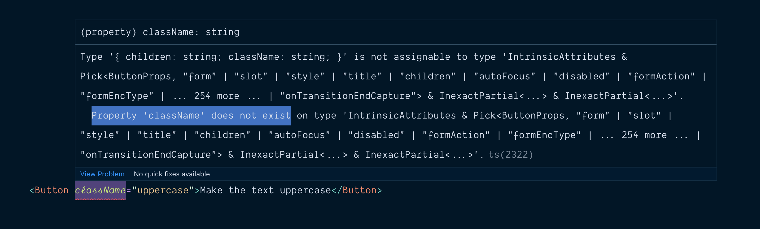
We’re being told the className property does not exist on our ButtonProps type.
In... some sort of cryptic way, it’s not super easy to read for a human.
Let’s do a fun little workaround.
We’re going to add a className optional property in our ButtonProps type, and set the expected value to be a human sentence:
interface ButtonProps extends Omit<ComponentProps<'button'>, 'className'> { variant: ButtonVariant size: ButtonSize className?: `Hey, sorry but you can't pass classes to the Button component - Design System decision 🤷️`}
We’re setting the type of our className prop to a particular string.
It’s doubtful that a user would try to pass this exact string in the className attribute.
And even if they did, nothing wrong would happen.
So, it’s a nice little trade-off since we’re trying to improve the developer experience.
TypeScript is not making it to the browser - it’s just a tool for development. We’re not going to introduce any bug with this, so I think it’s an acceptable “hack”.
What does it do?
Here’s what the error message looks like now when a className attribute is added to the Button:

Nice!
I bet this is more useful to the developer trying to use our component!
Of course, you could be more descriptive with the message and explain why the design decision was made.
But you get the idea!
Our little effort in TypeScript has greatly improved the experience of developers using our Button.
We’re saving them a few google searches, and source code detectives work.
Maybe even a computer restart 😅
The Final (v2.0-final.updated.zip) version of our code
Ok, this time, we’re officially done!
Here’s the final (yea right!) version of our Button component’s code:
import type { ComponentProps } from 'react'const baseClasses = 'rounded-md font-medium focus:outline-none'const variantsLookup = { primary: 'bg-cyan-500 text-white shadow-lg hover:bg-cyan-400 focus:bg-cyan-400 focus:ring-cyan-500', secondary: 'bg-slate-200 text-slate-800 shadow hover:bg-slate-300 focus:bg-slate-300 focus:ring-slate-500', danger: 'bg-red-500 text-white shadow-lg uppercase tracking-wider hover:bg-red-400 focus:bg-red-400 focus:ring-red-500', text: 'text-slate-700 uppercase underline hover:text-slate-600 hover:bg-slate-900/5 focus:text-slate-600 focus:ring-slate-500',}const sizesLookup = { small: 'px-3 py-1.5 text-sm focus:ring-2 focus:ring-offset-1', medium: 'px-5 py-3 focus:ring-2 focus:ring-offset-2', large: 'px-8 py-4 text-lg focus:ring focus:ring-offset-2',}type ButtonVariant = keyof typeof variantsLookuptype ButtonSize = keyof typeof sizesLookupinterface ButtonProps extends Omit<ComponentProps<'button'>, 'className'> { variant: ButtonVariant size: ButtonSize className?: `Hey, sorry but you can't pass classes to the Button component - Design System decision 🤷♀️`}export const Button = (props: ButtonProps) => { const { variant, size, ...rest } = props return <button {...rest} className={`${baseClasses} ${variantsLookup[variant]} ${sizesLookup[size]}`} />}Button.defaultProps = { variant: 'primary', size: 'medium',}
And here’s what it looks like in the browser:
You did it! You made it to the end of the tutorial.
Well done, champion 🎉
Ok, so we built a simple Button component.
Now, what if we...
- Added Storybook to our project to work on that
Buttonwith an easy preview of different states and scenarios? - Created a monorepo setup, so we can build multiple, separate websites and web apps that consume our
Buttoncomponent without the need to publish it onnpm? - Added support for multiple themes using CSS variables and Tailwind’s Plugin API?
- Create a more complex component that bakes in JavaScript behavior, keyboard navigation, and accessibility?
Well, that’s exactly what we’ll be doing in the Pro Tailwind course.
I hope you’re looking forward to it!
Have a great rest of your day! 🤗